Case study 5 of 5 · Self-initiated concept
Making a dense CAD interface touch-friendly
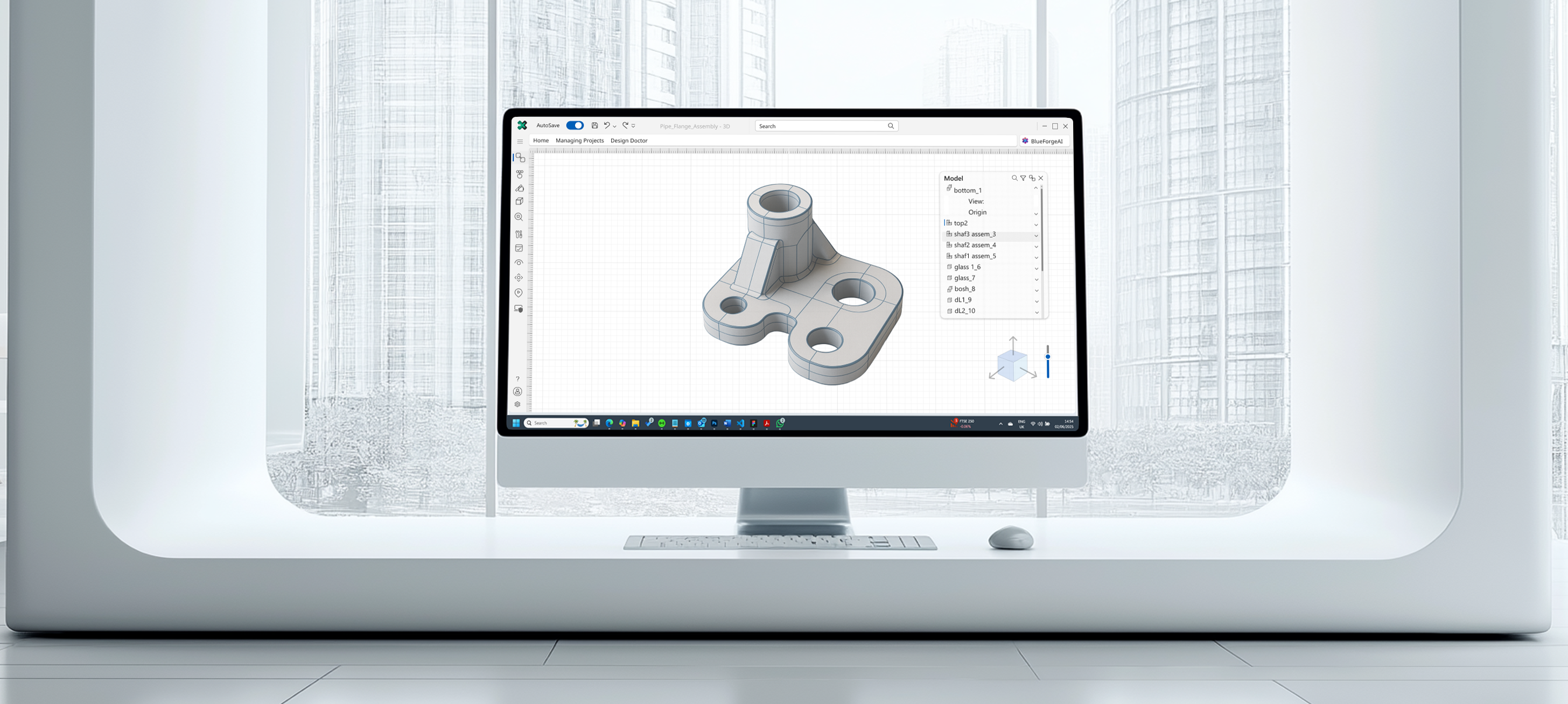
I redesigned the assembly workspace of an older Autodesk 360 (around 2014–15) as a native Windows app with Microsoft's Fluent UI, to practise designing inside an established component system and for touch.
| Type | Self-initiated concept, not affiliated with Autodesk |
|---|---|
| Role | Solo: analysis, interaction and visual design |
| Time | A few days |
| Tools | Figma, Microsoft Fluent UI |
The old interface offered too many choices at once
Ribbon toolbar, long assembly list and 3D viewport all competed for attention, and nothing was built for touch.
Starting from a screenshot of the original, I reviewed the assembly workspace against core usability principles and basic accessibility checks.
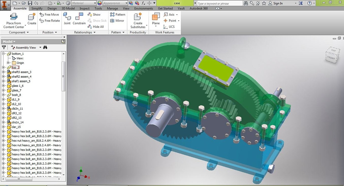
The full review
- Choice overload (Hick's law). Each ribbon tab packs in dozens of small icons, so every action starts with a search.
- Small targets (Fitts's law). Tightly packed icons are slow to hit with a mouse and unworkable with a finger.
- Too much on screen (Miller's law). Ribbon, an unfilterable assembly list and the viewport compete for attention.
- Accessibility gaps. Low-contrast grey icons, no visible labels, no clear focus states for keyboard users.

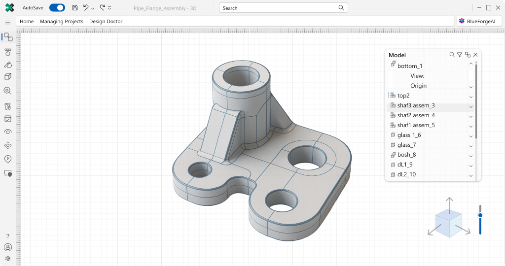
Fewer choices on screen, bigger targets, clearer structure
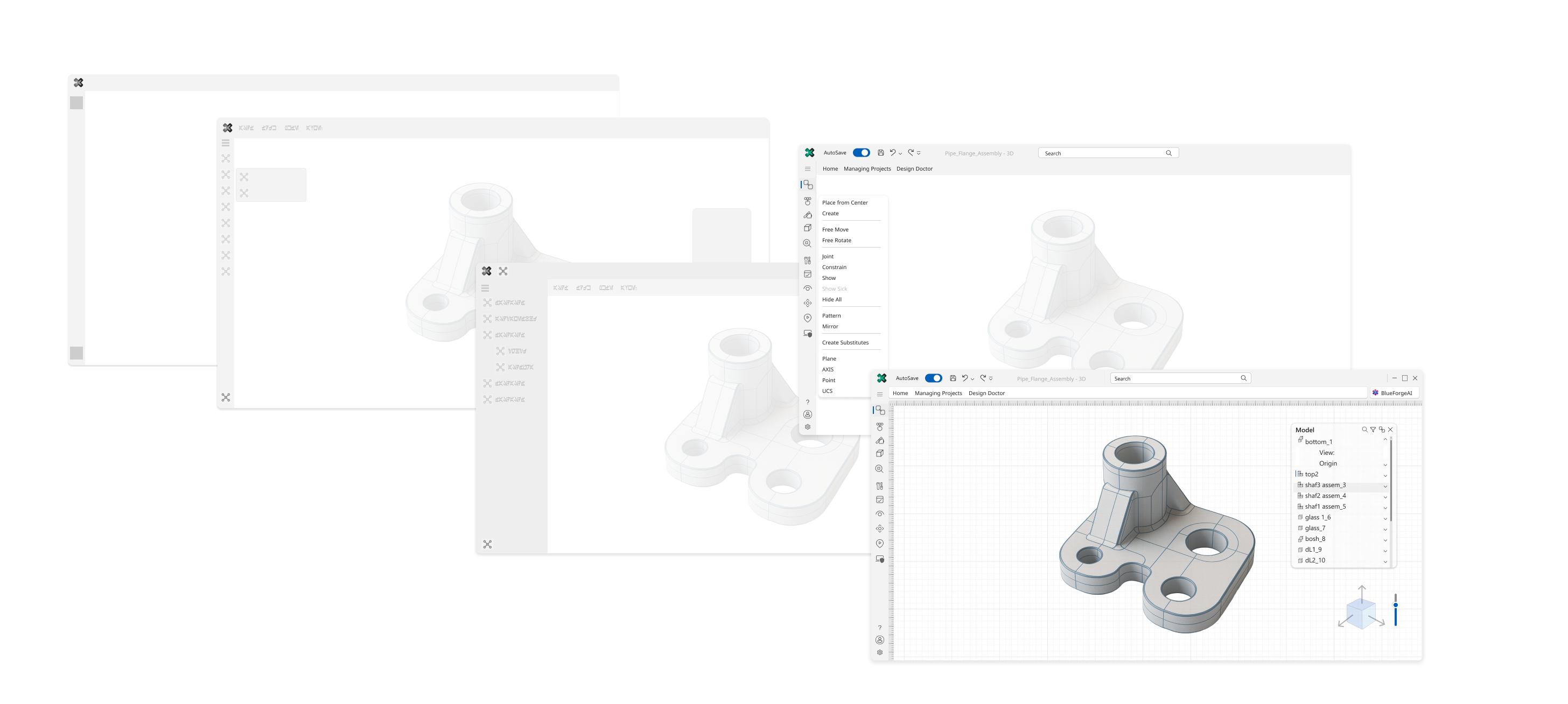
A command bar replaced the ribbon, and the assembly became a collapsible panel.
- A command bar instead of the ribbon: search plus the essential tools.
- A collapsible Model panel: the assembly as a hierarchical, filterable list.
- Built for touch and keyboard: larger labelled targets, visible focus states, a higher-contrast theme.
From wireframes to final
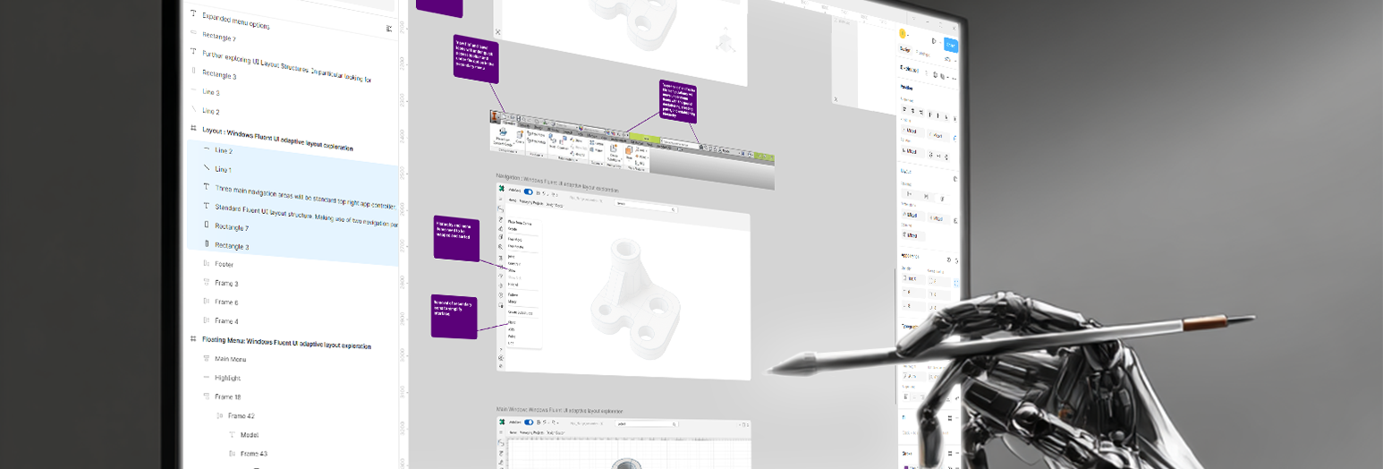
I moved from sketches to wireframes to high-fidelity screens in Figma, building only from Fluent UI patterns so the result would feel native to Windows.
What I checked, and what I'd do next
An informal walkthrough, not a measured study.
I walked 3 people through the screens on Windows, including a Surface touch device. They found navigation clearer and the dropdowns easier to use by touch, and a second iteration improved how the dropdowns respond.
As a concept it has no measured results. Next I'd finish the interactive prototype and run timed tasks against the original, by mouse, touch and keyboard.